"We need a website and a way for people to sign up."
Gary called me into a quick huddle. Michael had phoned him the day before from a yacht off Croatia, skipping dinner to talk it through: he had people ready to sign up for a January retreat, and nothing to send them to. Promotion was meant to start in about a week.
The event is a private, 90-day experience called The Thing After the Thing. It opens with four days at Miraval Austin, a wellness resort in the Texas Hill Country, then 90 days of testing real options at home, then a reconvene. The first cohort is a Founding Circle of 10 to 15 people at $10,000 each.
What I had to work with: a 49-minute recorded call between Gary and Michael, a long ChatGPT thread where Gary had drafted positioning and a process, and my own notes from the huddle. Gary's instruction was to get a first draft up within the hour and not overthink it.
I wasn't part of running the event. My job was everything a buyer would touch before they got there: the brand, the site, the payment, and the record of who applied and who paid.
Already sold, very wealthy, and mostly over 50.
The buyers are founders before or after an exit, CEOs stepping away, investors, and retiring pro athletes. Gary put the age range at 40s to 70s. For most of them, $10,000 is not a big decision. What they care about is whether the thing is serious, and whether the other people in the room are worth their time.
Just as important, nobody would find this page cold. Gary and Michael send the link personally, after a conversation. So the page didn't need to persuade from zero. It needed to confirm the decision, answer the practical questions, and get out of the way.
- Large type and a simple, single-column flow
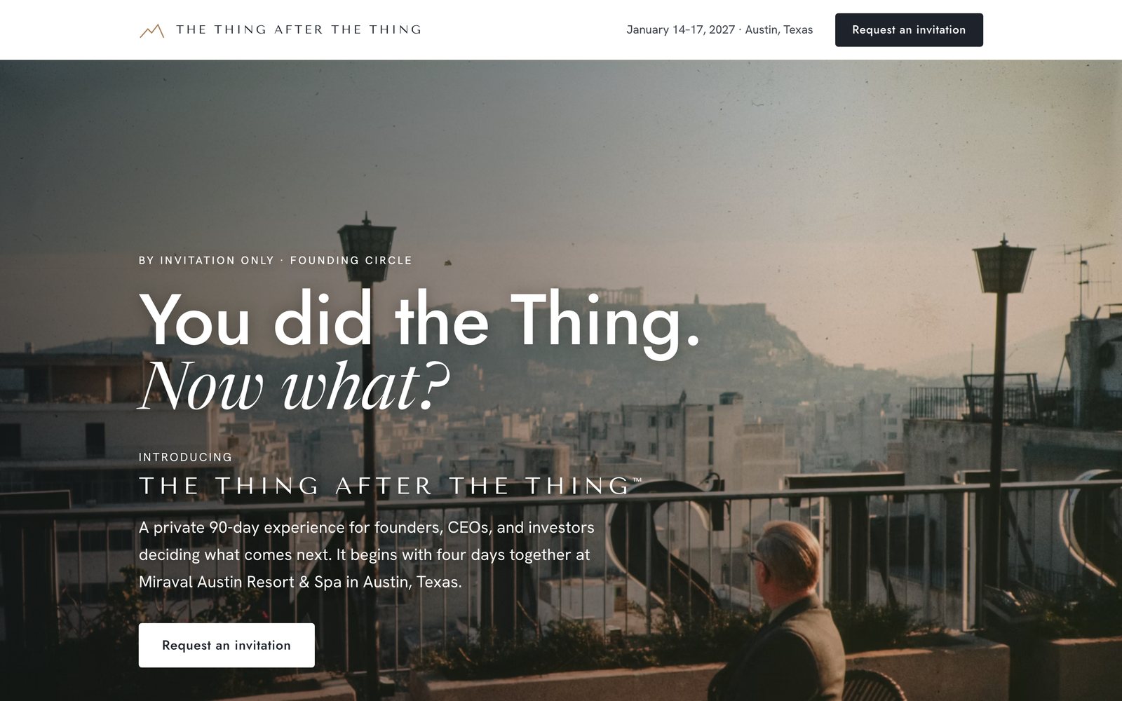
- Quiet, restrained visuals, closer to a luxury hotel than an event page
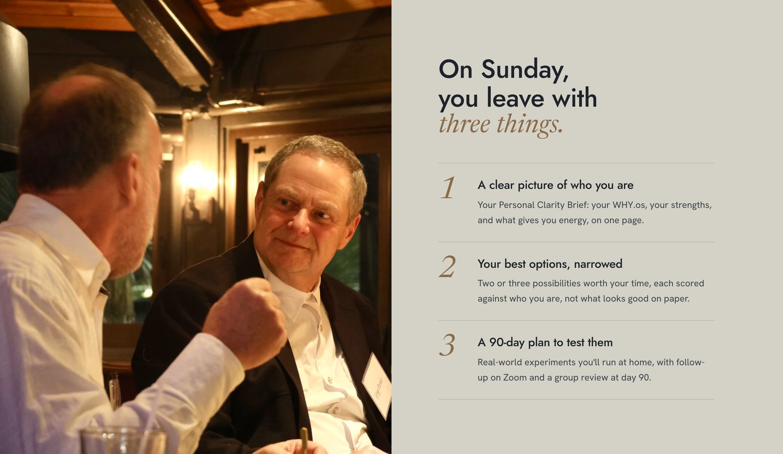
- Real headshots of the two leaders
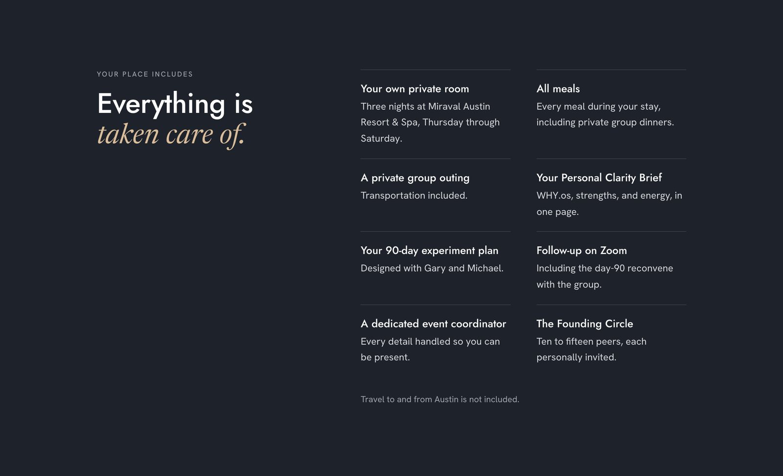
- Dates, venue, price, and what's included, stated plainly
- Countdown timers, urgency banners, "only 3 spots left"
- Conference, stage, or stock-crowd imagery
- AI-altered faces (this had already gone wrong on an earlier flyer)
- Any word that makes the first cohort sound like a trial: beta, pilot, discount
A new brand, deliberately not WHY Institute's.
The retreat is a joint venture between two founders, so it couldn't wear either company's colors. I gave it its own identity and kept WHY Institute to a small "powered by WHY.os" credit.
Before choosing anything, I studied a dozen reference pages across three groups: luxury hospitality (Aman, Rosewood, Six Senses, and Miraval itself), invitation-only retreats that sell at a similar price, and quiet-luxury product brands like Hermès. I wrote the patterns down rather than the pages: lots of white space, very little color, one strong photograph at a time, serif italics used sparingly as an accent, and prices shown plainly with no sales language around them.
 The mark: a single camel line drawing two peaks. It sits beside the wordmark in the header and works on its own as the profile image.
Body text starts at 19px, larger than most sites, because of who is reading. The one place I spent real time was the hero photograph. I needed an image of someone looking ahead, capable and not lonely, that didn't look like stock. I chose a film-toned photo of an older man on a rooftop looking out over a city.
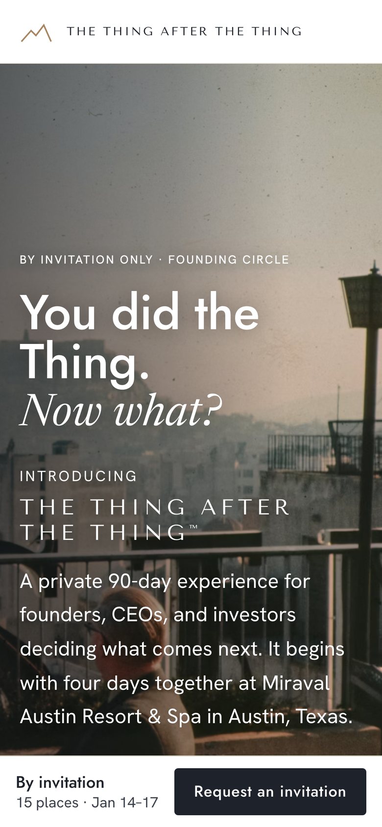
One page, written so the reader feels known.
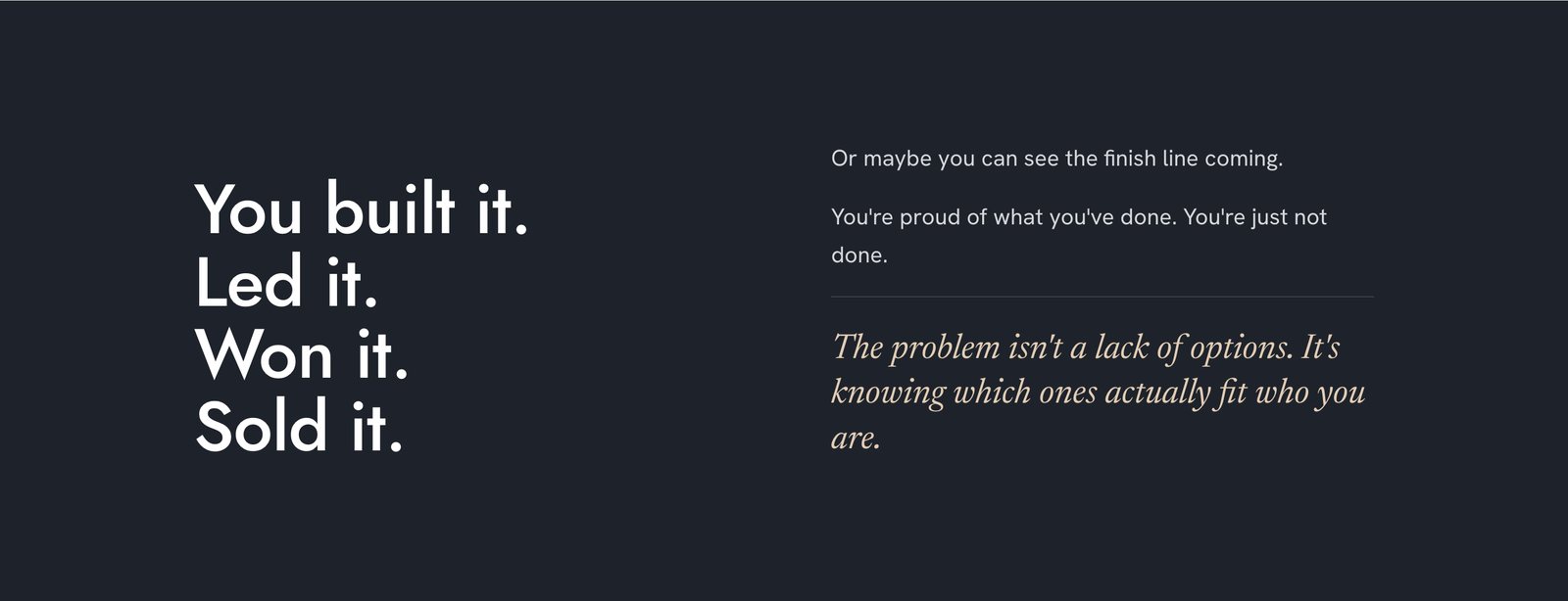
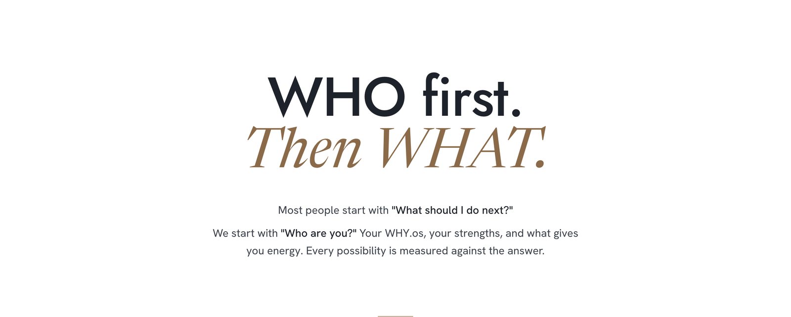
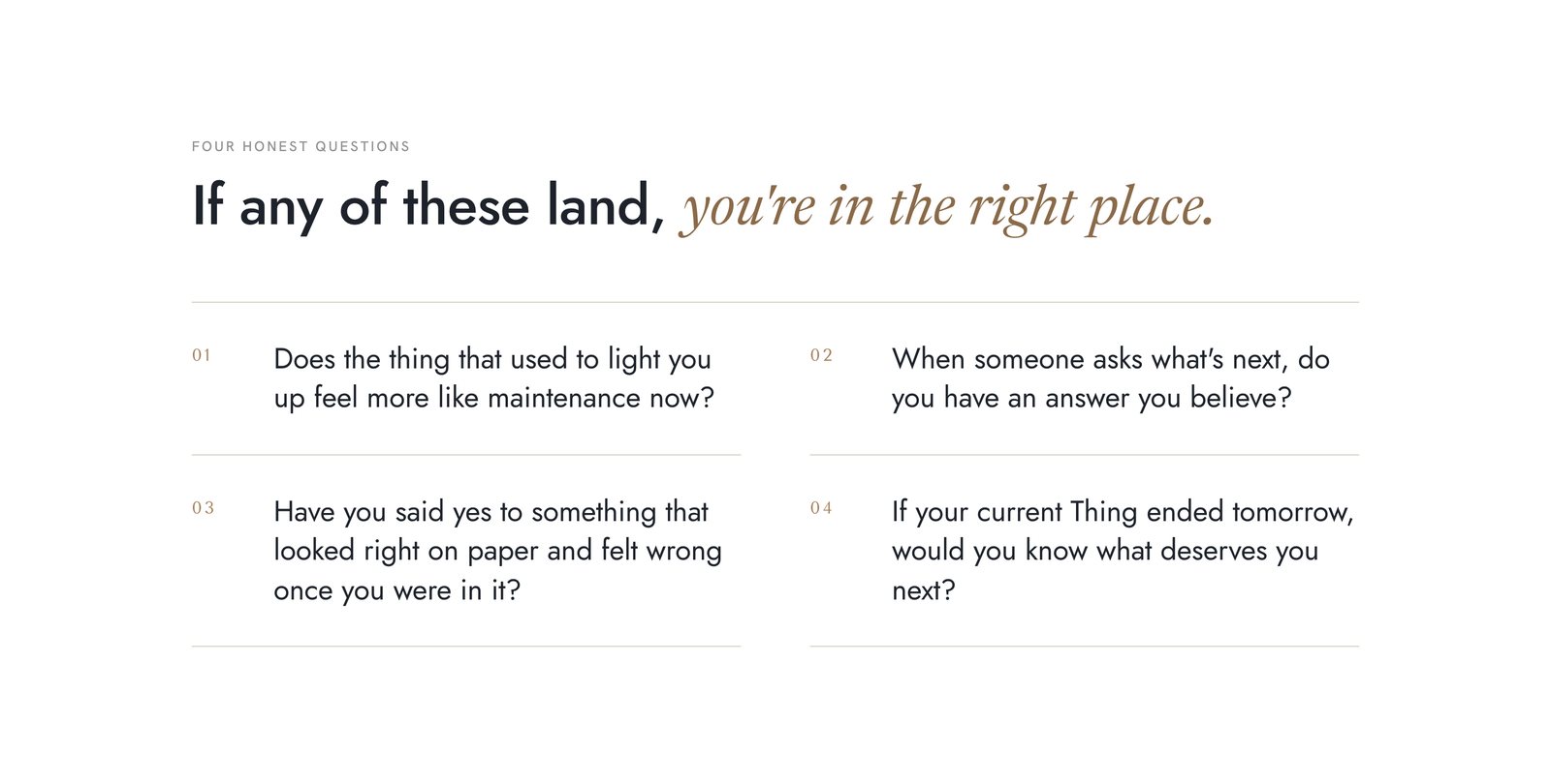
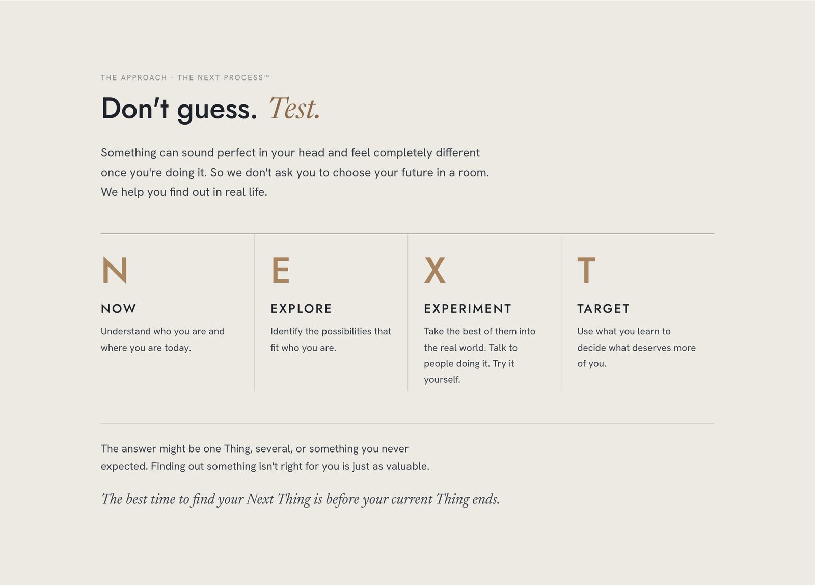
Gary's thread had plenty of good lines and no structure. I turned it into a clear order: the brand, then the hook ("You did the Thing. Now what?"), then the deeper question, then the method ("Don't guess. Test."). Michael had one specific request from the call: three or four pointed questions near the top so the reader feels recognized before they read anything about logistics.
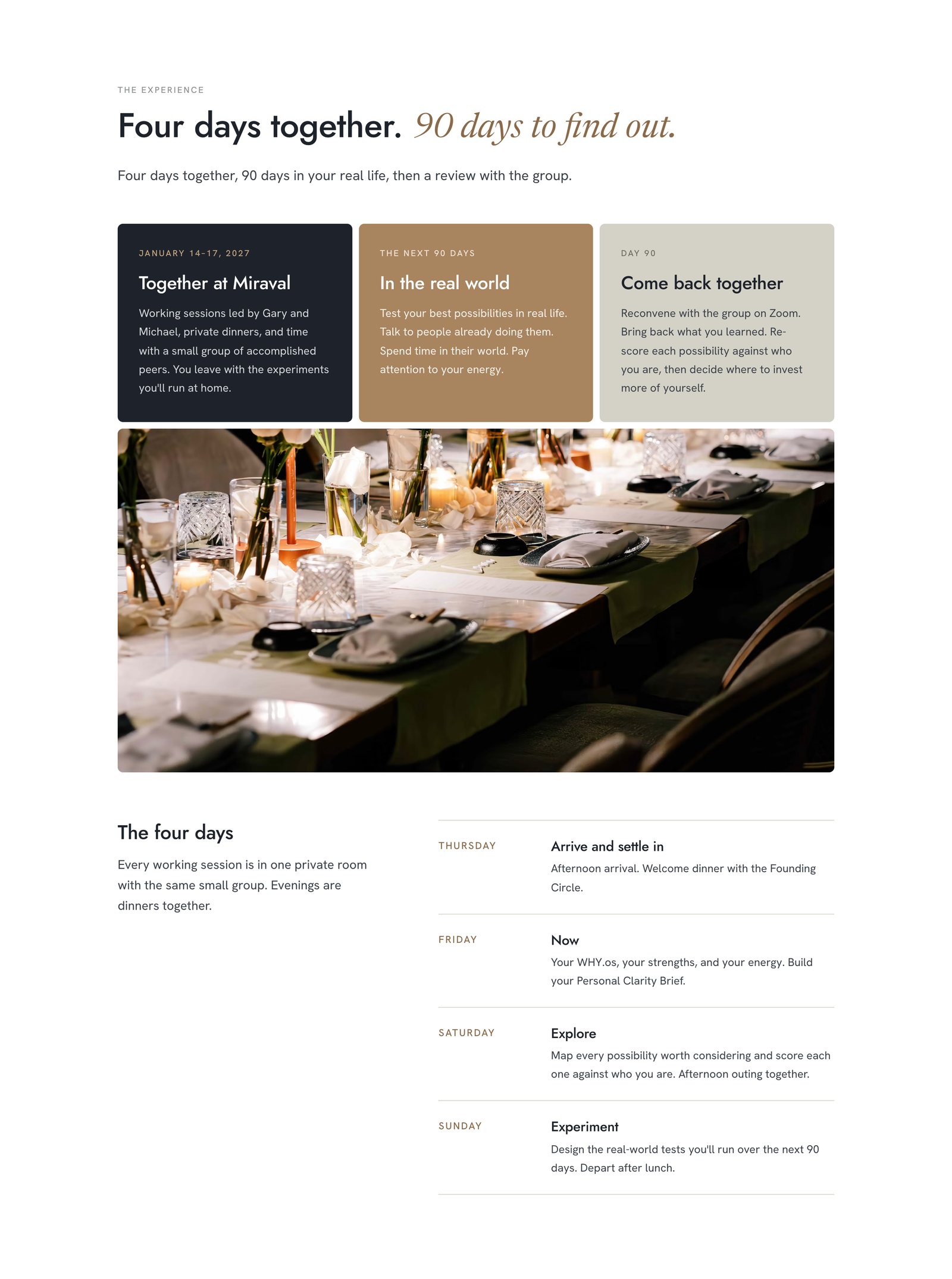
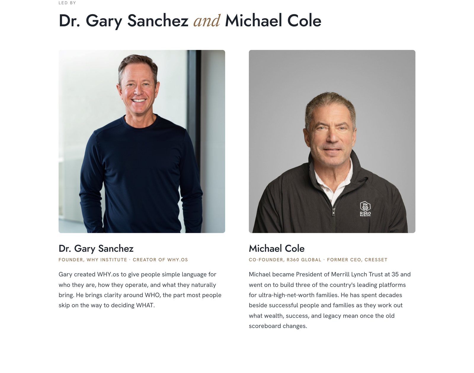
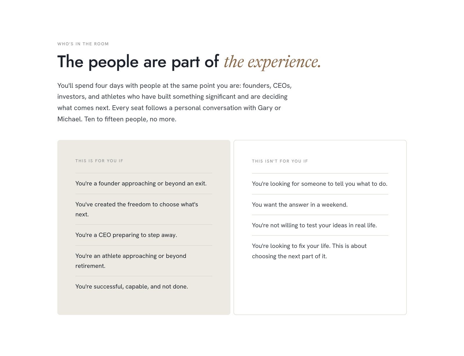
I built a checkout on the page. Then we took it off.
The first version had a checkout right on the public page, with a $2,500 deposit toward the $10,000 place. It worked. Then came the question of what "invitation only" actually has to mean in practice, and the answer changed the design.
If anyone with the link could pay, the Founding Circle wasn't curated, it was just expensive. So I split the site in two:
-
The public page asks for an invitationEvery button leads to a short form: name, email, phone, and an optional note. Submitting it logs the request and emails Gary and Michael, who reach out to set up a call.
-
A private page takes the paymentPeople approved after that call get a separate link. It welcomes them by invitation and holds the checkout. It isn't linked anywhere on the site and is hidden from search engines.
-
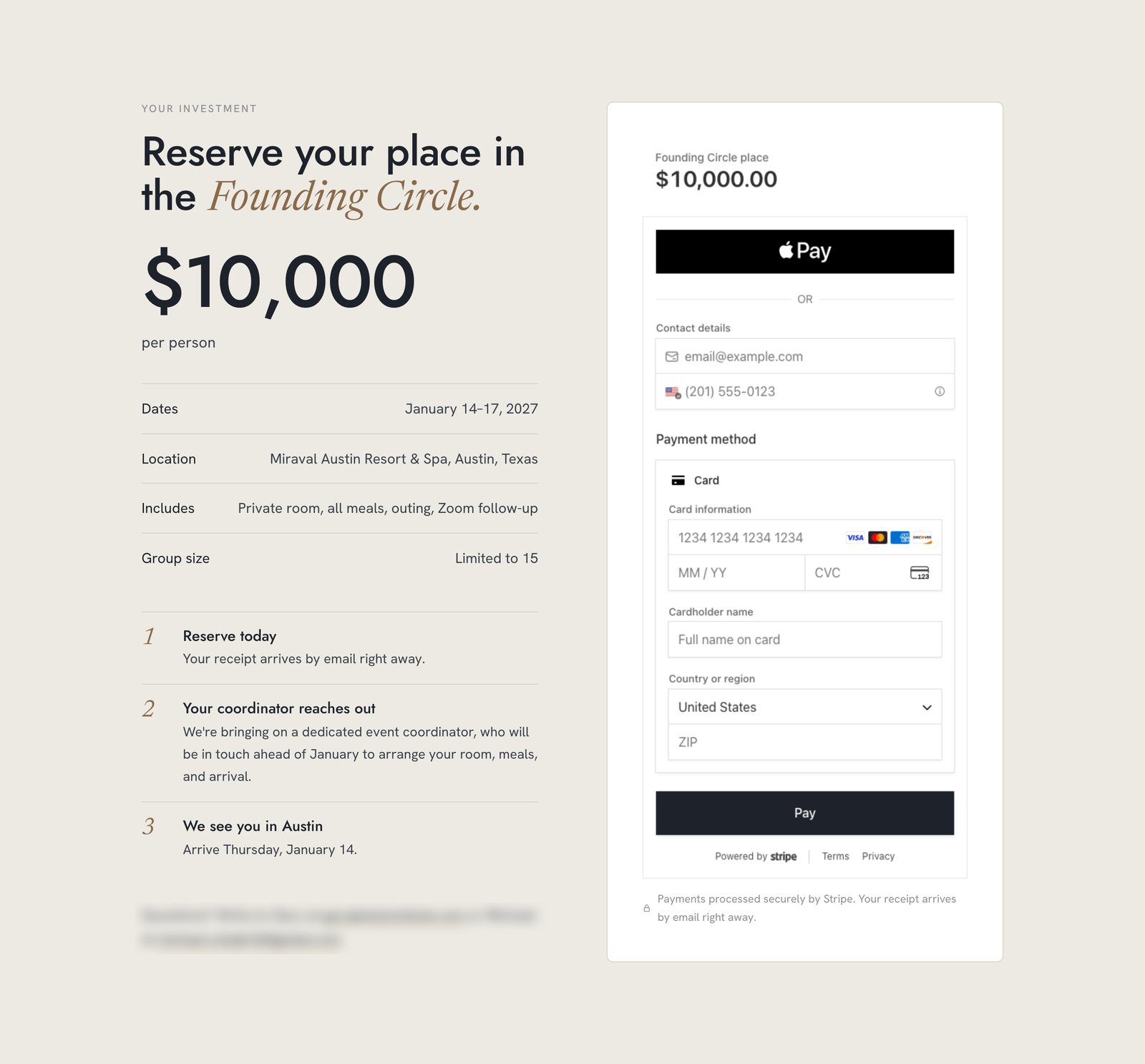
One clear priceThe deposit and early-bird tiers came out. Approved guests pay the full $10,000 in one step. For this buyer, fewer choices read as more confidence.
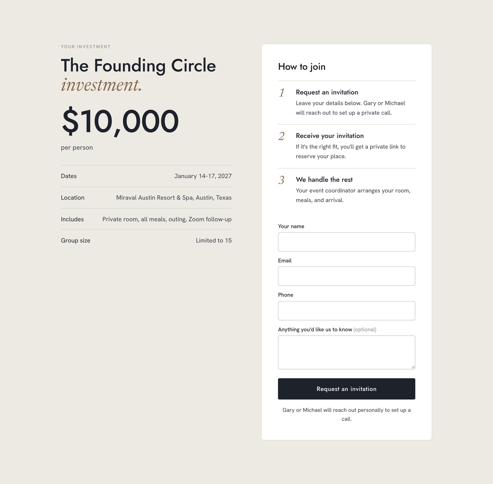
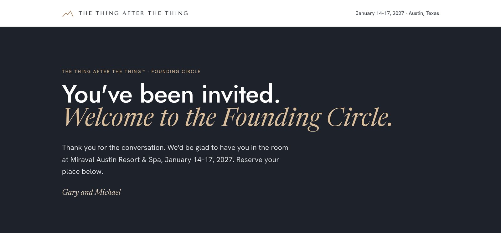
Building the checkout first wasn't wasted work. Once it existed, we could see what it implied, and it made the invitation question concrete enough to decide.
A new product inside our Stripe account, without disturbing anything already there.
The fast option was WHY Institute's existing Stripe account. The risk was that WHY Institute's own app already watches that account. It listens for new products, new prices, and successful payments, and those events can trigger emails and account unlocks. A $10,000 retreat payment accidentally unlocking an app account, or sending a WHY Institute receipt, would be a bad first impression.
So I set the checkout up to leave as small a footprint as possible:
- No new product or price objects. The $10,000 line item is defined inside each checkout session, so the app's "new price" listener never fires.
- Every payment is tagged with its source and cohort. Anything downstream can filter to exactly these payments, or ignore them.
- Branding set per session. The checkout shows The Thing After the Thing's name and charcoal button without touching the account's WHY Institute branding.
- Its own card statement line, "THING AFTER", so a $10,000 charge from a name the buyer doesn't recognize never becomes a dispute.
- Cards and Apple Pay only. I hid Stripe's Link sign-up prompt, which the account shows by default. One less unfamiliar screen for a 70-year-old buyer.
- Embedded on the page rather than sent to a separate Stripe screen, so the price, dates, and venue stay visible beside the form the whole time.
- Test mode first. A full test payment went through end to end, including the tracker, before I switched to live keys. Apple Pay is registered for the domain in both modes.
A spreadsheet that fills itself.
Gary and Michael don't live in Stripe, and neither will the coordinator who runs the event. They needed one place to see who has asked, who has paid, and how to reach them. For a group of 15, a spreadsheet was the right tool. The work was making sure nobody ever has to type into it.
- Request formName, email, phone, note
- Site serverChecks the fields, trims long input
- SheetNew row on "Invitation requests"
- EmailGary, Michael, and the team. Reply goes to the guest
- Stripe checkout$10,000, tagged to this event
- WebhookSignature verified, other payments ignored
- SheetNew row on "Reservations," live or test
- Email"Founding Circle reservation: [name]"
| Paid at | Name | Phone | Amount | Status | Mode | Stripe session | ||
|---|---|---|---|---|---|---|---|---|
| 2 | ||||||||
| 3 | ||||||||
| 4 |
The tracker's structure, recreated here without any guest data. Each tab creates its own headers, date format, and currency format the first time it's written to.
Built for the things that go wrong
- No duplicate rows. Stripe retries a notification for up to three days if it doesn't get a clean answer. The sheet checks each payment's ID and skips any it has already logged, so a retry can't record the same $10,000 twice.
- No fake rows. The website only accepts payment notifications that carry Stripe's signature, and the sheet only accepts writes that carry a shared secret.
- Test payments are marked "Test" and their emails are flagged, so a check I run later never looks like a real booking.
- Every notice is ready to reply to. Replying to the email goes straight to the guest, so Gary or Michael can follow up in one step.
- Owned by the event, not by me. The sheet and its automation were moved to an account that belongs to the event, and the notices send from it, so nothing depends on my personal login.
Notes in at 9:50. Everything live and tested by 1:45.
Timestamps from the build files, all on September 25, 2026:
- 9:51 amSources in. The call transcript, huddle notes, and Gary's thread loaded into the project.
- 10:17 amFirst full draft rendering on desktop and mobile, inside Gary's one-hour ask.
- 10:30 – 11:15Section-by-section passes: venue, leaders, format, what's included. Checkout working locally in test mode.
- 12:00 pmLive on TheThingAfterTheThing.com with the domain connected and a security certificate in place.
- 1:00 pmThe split. Private approved-guest page with the full $10,000 checkout and the payment notification to the sheet.
- 1:45 pmInvitation form, both sheet tabs, and email notices live and tested. Handoff written up in ClickUp.
Plain tools, chosen so someone else can run it.
In the huddle Gary asked which AI tool we should build with. I picked Claude Code because I was already shipping with it daily. It wrote the implementation while I made the calls on audience, brand, structure, copy, what the checkout was and wasn't allowed to touch, and what the tracker needed to survive. I reviewed everything before it went live.
- Static HTML and CSS, no framework, so a copy edit is a one-line change.
- Vercel for hosting, with four small serverless functions: create a checkout, check its status, receive Stripe's notification, and receive the invitation form.
- Stripe Embedded Checkout on WHY Institute's existing account, isolated as described above.
- Google Apps Script attached to the sheet, as a small web endpoint that writes rows and sends the emails.
- GoDaddy DNS on Gary's existing domain, pointed at Vercel.
- Live keys only in the hosting environment, with a local test server that runs on test keys so nothing I try while editing can charge a card.
Live, taking requests, and honest about what's still open.
The site went live on September 25, and outreach begins in October. There are no registration numbers yet, and I'm not going to invent any. These are the open items I handed off, with owners:
- Gary: approve the day-by-day agenda, the four questions, and his bio. Decide the time commitment across the 90 days, the fee for spouses, and the refund policy.
- Michael: get Miraval's permission for the resort photos on the page. They're placeholders from the resort's own site until then, which is why none of them appear in this case study.
- App developer: confirm the WHY Institute app's payment listener ignores these payments. The tagging makes that a one-line filter, but I flagged it rather than assumed it.
From a phone call to a working business in one day.
This is a small site. The skill it shows is taking a loose idea and a hard deadline and deciding, quickly, what actually has to be true. The buyer is already sold, so the page confirms rather than persuades. Invitation only has to be enforced by the design, not just stated. A new product can't be allowed to disturb the systems already running in the same account. And the people running the event need a list they'll actually open.
That's the same instinct I bring to marketing operations work: build the system around how people will actually use it, protect what's already running, and make sure the data lands somewhere useful without anyone having to type it in.
Brand, site, checkout, and tracker, built by one person between breakfast and early afternoon. And still running without me watching it.